धरोहर धागों की – Heritage Woven in Threads
A complete visual identity for a women's ethnic-wear boutique — a Devanagari 'ध' monogram, an earthy heritage palette and a full type system, delivered in one week and now in active use across the store.
Project Overview
Client: धरोहर धागों की · Industry: Women's Clothing, Fabrics & Boutique · Scope: Brand Strategy, Logo Design, Colour Palette, Typography System, Packaging & Signage Mockups · Timeline: 1 Week (2 rounds of revision) · Tools: CorelDRAW & Adobe Photoshop.
धरोहर धागों की approached us to build a complete visual identity for their boutique — a label rooted in Indian textile heritage, women's ethnic wear, and handcrafted fabric artistry. The brief called for a mark that felt premium, feminine and timeless, avoiding anything generic, overly literal, or decorative for its own sake.
Deliverables: primary logo, colour system, type system, and label / packaging / signage mockups — final artwork delivered in editable CDR format, now in active use across the client's boutique and in-store display.
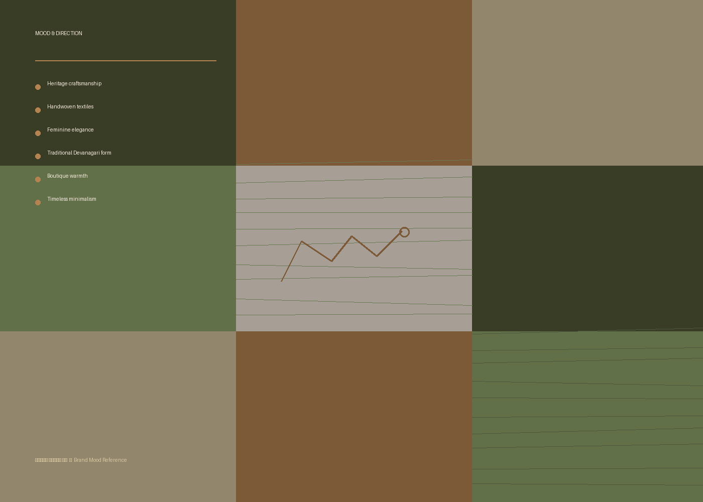
Before any visual exploration began, we defined the brand's core territory: heritage, craftsmanship, and the emotional bond between fabric and tradition. The name itself — 'धरोहर धागों की', meaning 'heritage of threads' — set the tone for every decision that followed. We anchored the strategy around three pillars:
- 01Heritage: Rooted in traditional Indian textile and craft sensibility, never costume-like or clichéd.
- 02Feminine Elegance: Soft, confident, boutique-luxury, built for a discerning clientele.
- 03Timelessness: A mark designed to outlast trends, working equally well on a woven saree label or a storefront sign.

Colour Palette
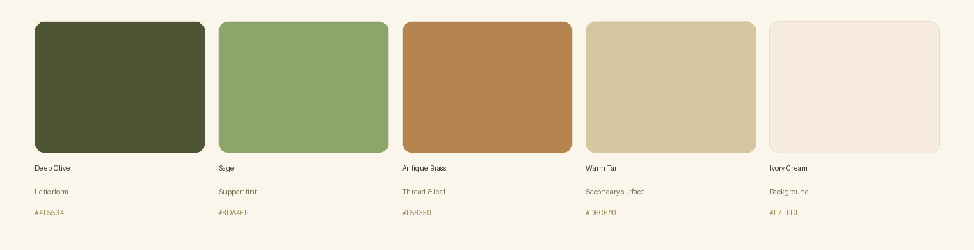
The palette was developed to feel earthy, premium and distinctly Indian — deep olive for gravity and heritage, antique brass for warmth and craft, and soft ivory to keep the system light and boutique-appropriate.
Typography System
The wordmark uses a refined Devanagari display letterform for 'धरोहर धागों की', chosen for its bold, heritage-driven character — confident enough to anchor the mark, warm enough to feel handcrafted rather than corporate.
It is paired with a clean, neutral sans for supporting text — tags, care labels, packaging copy and digital use — to keep everyday communication legible at small sizes.
Logo Design Process
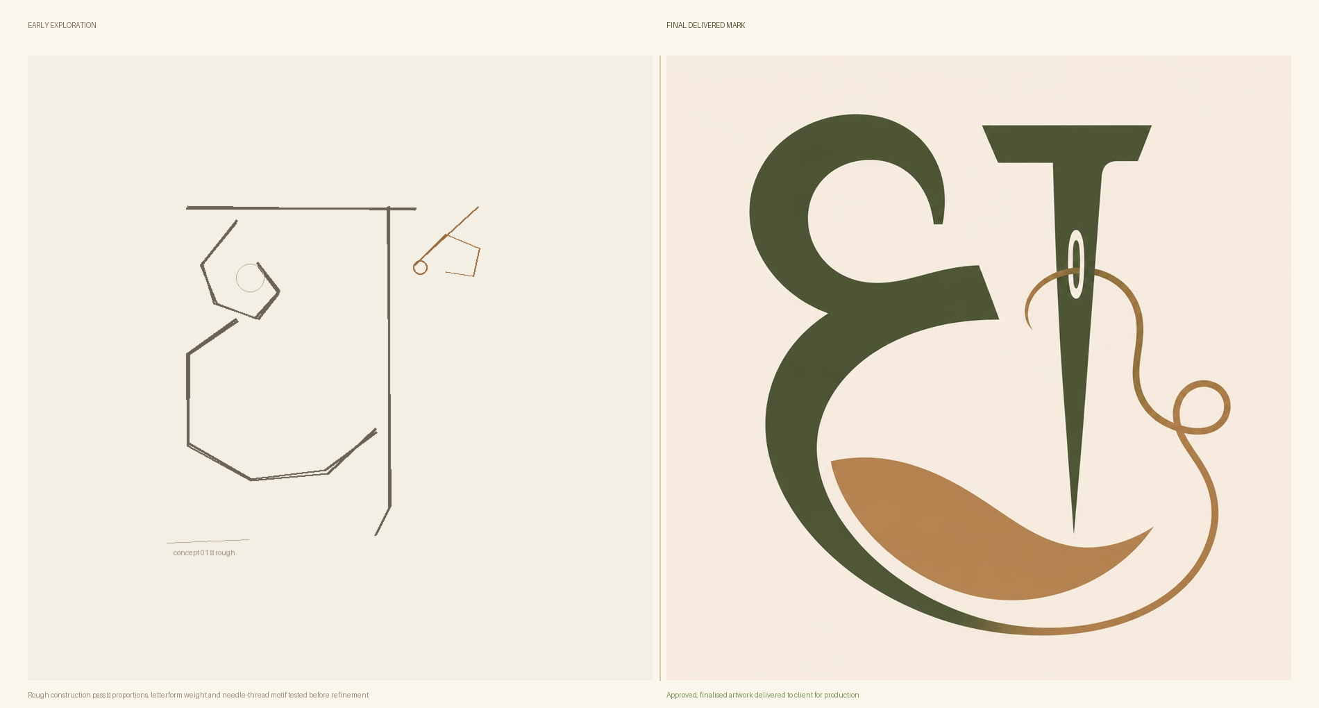
The design centres on the Devanagari letter 'ध' — the first sound of 'धरोहर' (heritage) — reimagined as a monogram. Rather than pairing the letter with a separate decorative icon, we built the brand's signature motif directly into the letterform's own strokes, so mark and symbolism read as one continuous gesture instead of two elements placed side by side.
Early exploration focused on proportion and weight: how tall the stem should stand, how open the bowl needed to be to stay legible at small sizes, and where a supporting motif could grow naturally out of the letter's own terminals without overwhelming it.
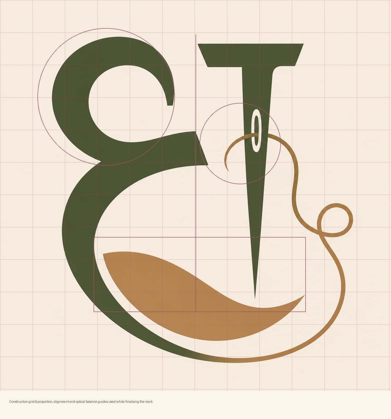
Once the core gesture was approved, we moved to precise construction — aligning the stem, bowl and flourish to a consistent grid so the mark holds its balance at every size, from a woven fabric tag to a full storefront sign.
Final Logo
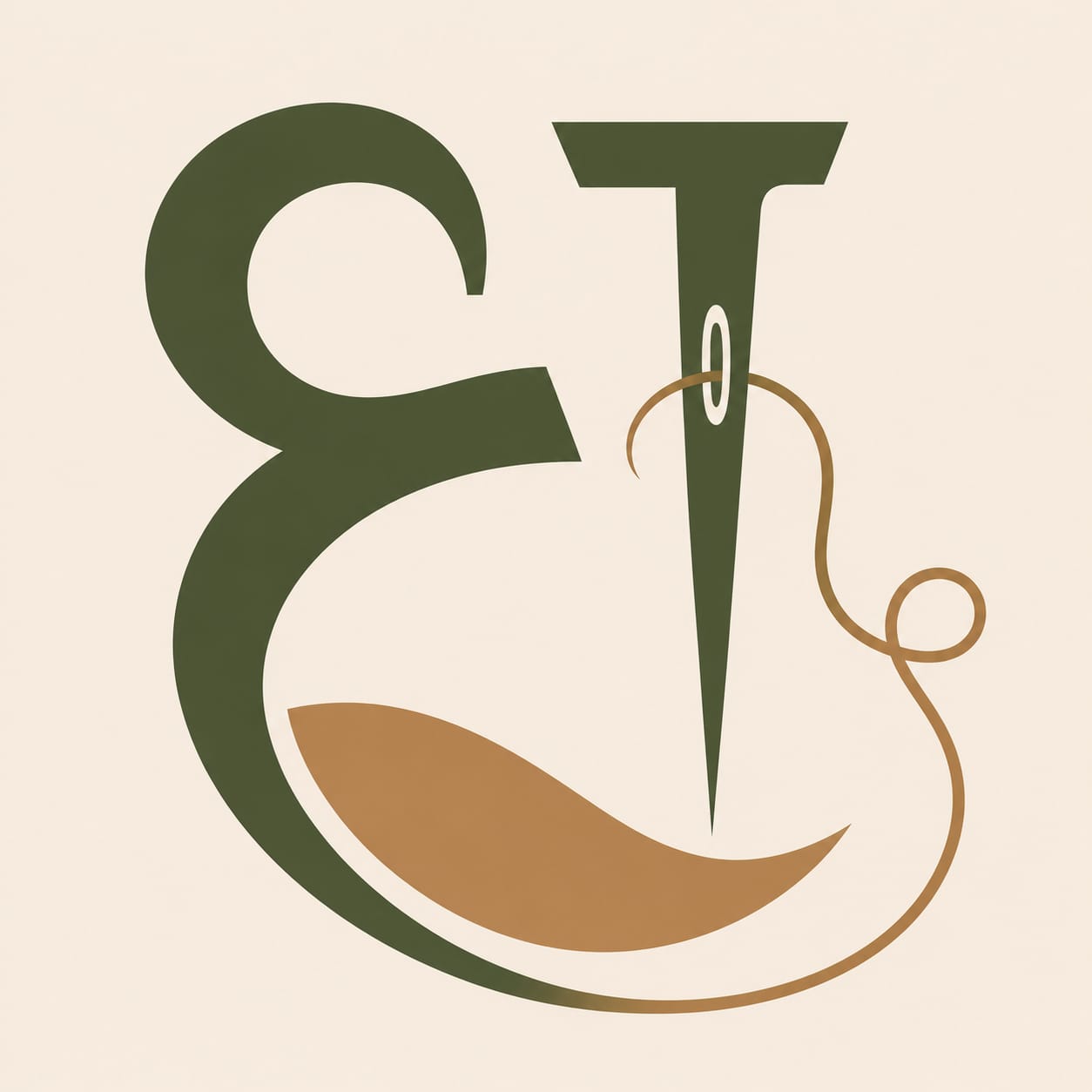
The finished mark balances a bold, heritage-inspired letterform in deep olive with a slender brass thread motif that curls away from the stem — a quiet nod to the brand's craft roots — resting above a soft, abstract fabric fold in warm tan. The result is a symbol that is distinctive on its own, without needing the full name beside it.
Brand Applications
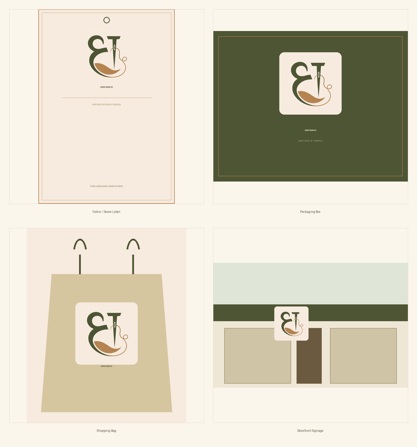
To make sure the identity held up beyond the screen, we mocked up the logo across the client's real-world touchpoints — fabric and saree labels, product packaging, shopping bags, and storefront signage. The mark has since been put into production and is on display in the client's boutique.
The full identity — from first strategy conversation to final, print-ready artwork — was completed in one week across two structured rounds of revision:
Day 1–2
Brand strategy, mood direction and colour exploration.
Day 2–4
Logo concept development around the 'ध' letterform.
Day 4–5
Client review (Round 1) and refinement of the selected direction.
Day 5–6
Final revision (Round 2), typography pairing and colour system lock.
Day 6–7
Application mockups, final artwork preparation and CDR handoff.
Day 1–2
Brand strategy, mood direction and colour exploration.
Day 2–4
Logo concept development around the 'ध' letterform.
Day 4–5
Client review (Round 1) and refinement of the selected direction.
Day 5–6
Final revision (Round 2), typography pairing and colour system lock.
Day 6–7
Application mockups, final artwork preparation and CDR handoff.
Using CorelDRAW for vector construction and Adobe Photoshop for texture, mockups and presentation.
Outcome
धरोहर धागों की now has a complete, cohesive brand identity built for longevity — a monogram that is ownable and recognisable on its own, a colour and type system that extends cleanly across packaging and signage, and finished artwork the client can put into production immediately. The logo is currently in active use as in-store display signage at the client's boutique.
“They turned the meaning behind our name into a mark we're proud to hang in the shop — it feels like heritage, and it's ours.”
धरोहर धागों कीBoutique Owner
Transforming digital vision into reality
More Case Studies
Rudradharma – Building a Transparent Spiritual E-Commerce Brand
Taking a trusted 1953 Rudraksha store online — 500+ SKUs, macro product photography, and META campaigns hitting 10–12× ROAS.
Dohabus – Qatar's Premier Destination Management & Sightseeing Platform
A conversion-focused digital platform for Qatar's leading sightseeing company — Hop-On Hop-Off tours, desert safaris, and online booking for global travelers.
Anvi Partners – A High-Converting Marketing & Growth Landing Page
A modern, conversion-focused single-page site (WordPress + Bricks + custom code) with a glassmorphism design system, built to drive free-audit bookings.
Make Value Obvious. Reduce Thinking. Increase Clicks.
A UX and conversion-rate-optimization engagement for a leading online fragrance & beauty retailer — five targeted interface changes across the listing page, homepage, and cart, each grounded in a before/after test and measured against real engagement data.
RITM Hospitality Institute Website
How we delivered a globally competitive website for Raboche Institute of Technology & Management (RITM), a hospitality education institute, without a premium budget to match.
Wafeeq – Making Digital Learning More Inclusive
Wafeeq is an inclusive digital learning platform created to make education, professional training, and career development more accessible to Deaf and Hard-of-Hearing learners.
Camera Market Dehradun – Bringing a Local Camera Store Online
A photography equipment store built for creators, photographers, filmmakers, and enthusiasts looking for reliable camera gear and accessories.